REFLECTIONS ON OUR LABELLING JOURNEY
- Holly Beaton
- Jun 4
- 3 min read


The Okavango Gin label began, much like the brand itself, with a desire to create something deeply connected to place. Before the bottles reached shelves, before the awards and exports and recognition, there was simply an idea; to craft a gin that could express something truthful about Botswana and the extraordinary landscape from which it came. The label became one of the very first ways we tried to tell that story visually.
Our original design started with a black-and-white sketch created by a local artist in Maun. At its centre sat a baboon perched atop a termite mound; an instantly recognisable scene for anyone familiar with the Okavango Delta. Baboons move freely through the bushveld and floodplains, while termite mounds rise from the earth like natural monuments across the landscape. Together, they captured something that felt unmistakably rooted in Botswana: wildness, humour, resilience, and an everyday encounter with nature that locals know intimately.

From the beginning, it mattered to us that the artwork itself was created locally. Even in its simplest form, it already carried a sense of identity and place that felt authentic to who we were becoming as a distillery. In those early years, we printed the artwork directly onto the glass bottle itself. There were practical reasons for this choice, of course. Printing directly onto glass was cost-effective for a young distillery finding its footing, but it also aligned with our desire to minimise excess material use wherever possible. Living where we live, one learns how much simplicity matters. We wanted the product to feel thoughtful rather than overworked, and environmentally conscious wherever we could manage it.


As the brand grew, however, so did the realities of operating in wider markets. Bottles travelled further, shelves became more competitive, and we began receiving honest feedback from distributors and customers alike. While people loved the liquid inside the bottle, many felt the packaging did not yet fully reflect the premium quality of the spirit itself – and that feedback became an important turning point.
Rather than abandoning the original design entirely, we chose to evolve it carefully. The baboon and termite mound had become symbolic of our story, and we knew we wanted to preserve that emotional connection.

So, we partnered with a designer in Cape Town who immediately understood the balance we were trying to strike. Together, we revisited the original sketch and began exploring how it could become something bolder and more distinctive while still honouring where it came from. The final direction drew inspiration from lino-print techniques; tactile, handcrafted, expressive, and slightly imperfect in all the right ways. Before the design was digitised, much of the artwork was physically created by hand, giving the label a sense of texture and character that felt aligned with the handmade nature of the gin itself.

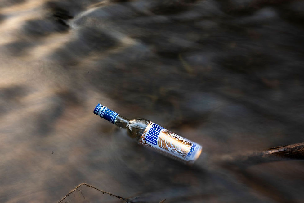
The introduction of blue and gold became another defining moment in the visual evolution of the brand. The colours brought warmth, visibility, and shelf presence, but they also introduced a feeling of richness and ceremony that elevated the overall identity. Suddenly, the bottle felt more confident in its own skin; unmistakably African, contemporary, and premium without losing its grounding in place.

Looking back now, the journey of the Okavango Gin label mirrors the journey of the distillery itself. It reflects growth without disconnection, evolution without forgetting origins. While the design has changed over time, the spirit behind it has remained remarkably consistent.
We understand that building Botswana’s first distillery, and creating a gin that could not be made anywhere else on earth, has always been about storytelling. We are sharing our place in the world with the rest of the planet, and our label is an attempt to visually capture a landscape shaped by water, wildlife, craftsmanship, and community. Now, with The Forager accompanying the original The Sentinel, we feel proud to see this visual language continue to evolve alongside the distillery itself; growing outward far and wide.
Today, every bottle is distilled, bottled, and labelled in our distillery; and beneath the blue and gold, the original baboon still sits atop the termite mound, watching over the Delta exactly where it all began.


Comments